Split Toning Effect in Photoshop
Split toning is a really effective way to adjust the colour and luminosity tones in our images. It can bring an overall balance to tonal values. There’s a number of ways that you can do Split Toning in Photoshop. The technique that we use in the tutorial is the easiest and most consistent technique for a Split Toning effect in Photoshop. You can use split toning to control the colours that are in luminosity ranges such as shadows and highlights, and also every range in between.

If you wish to experiment with this, I would really appreciate it if you included my name (Duke McIntyre) and www.shutterevolve.com when you publish your image. If you post your published image on our Facebook page I’d be happy to check it out.
Effective Use Of Split Toning
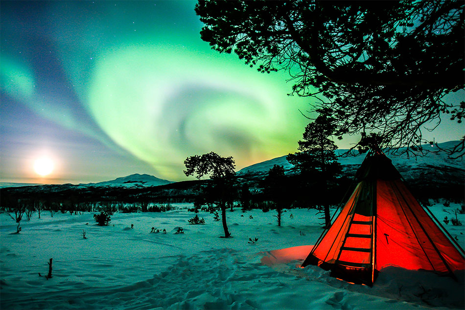
Split toning is not really for transforming images, although it can do this very well. The best way to use Split Toning is to complement colours in the scene. For example, if we look at the image below, you can see the brightest part of the image have a yellow and orange tint. But, the highlights in the clouds have a more pink tint.
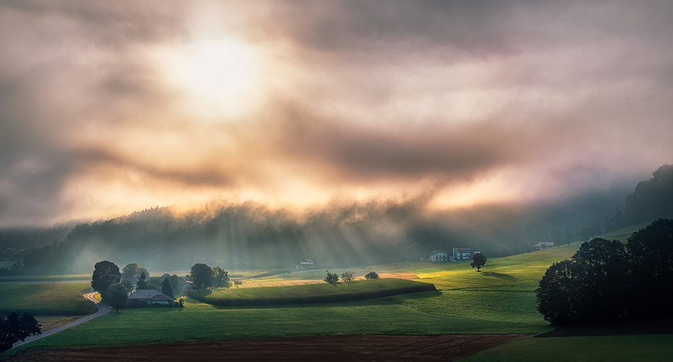
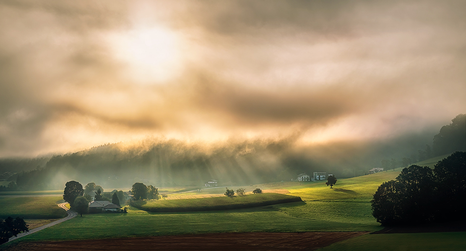
We can use Split toning to balance the highlight tones and bring more yellow and orange to the highlights, therefore bring the balance more in line with the area where the sun is shining through.
On the flip side, if you wanted to go the other way you could harness the pinks and purples in the scene. Below I used very strong colours to saturate the image to show you that split toning doesn’t have to be subtle and can be very flexible in photo editing.
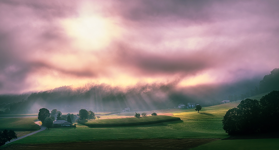
Photo by Simon Berger on Unsplash
-Tutorial Continued Below-
Enter your email below and join our community of more than 100,000 photographers who receive regular tutorials and have also
Subscribed to our newsletter,
Downloaded our FREE Photoshop Course
Got our FREE Easy Panel for Photoshop
And have our FREE Essential Guide To Luminosity Masks E-Book
How To Achieve A Split Toning Effect in Photoshop
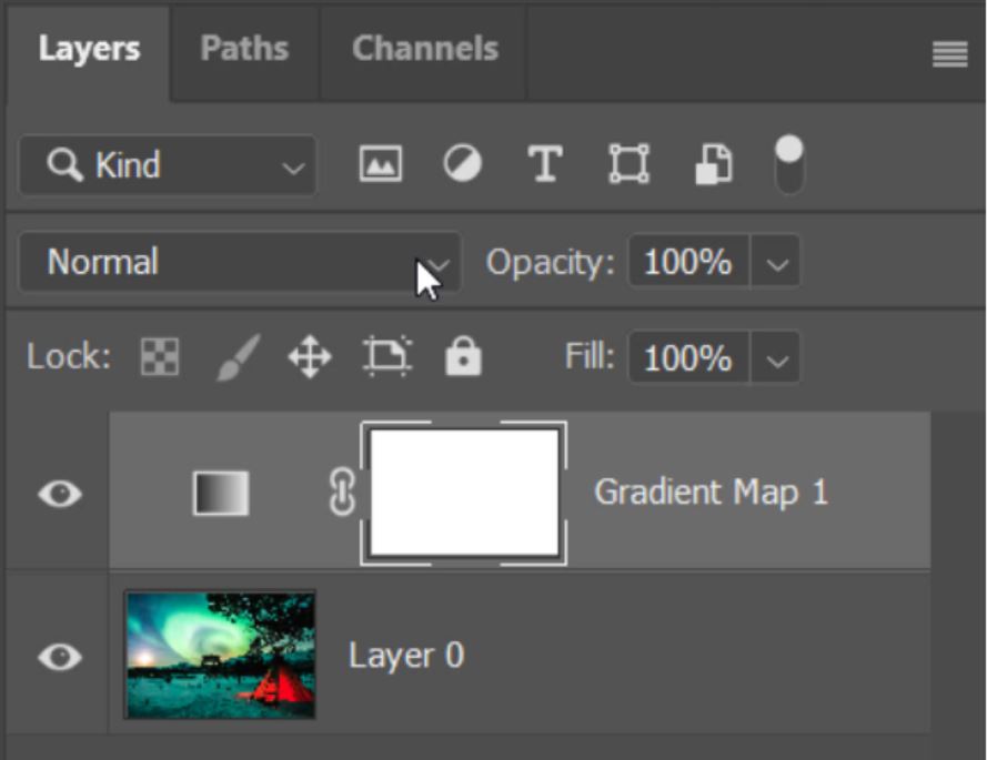
1. To begin split toning click on the Create New Adjustment Layer icon.
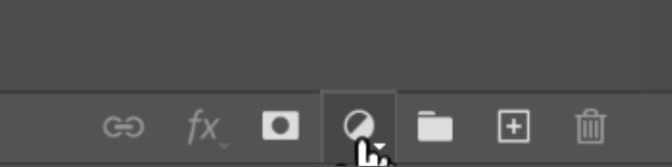
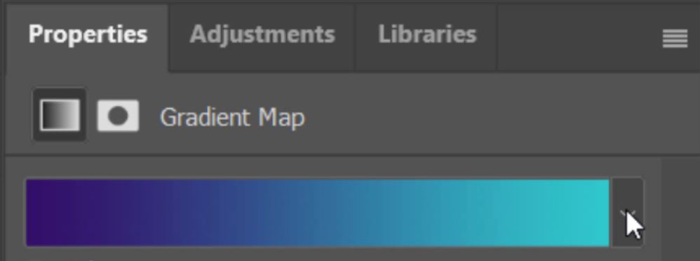
2. The Adjustment Layer that we’re going to use for split toning is a Gradient Map adjustment layer.
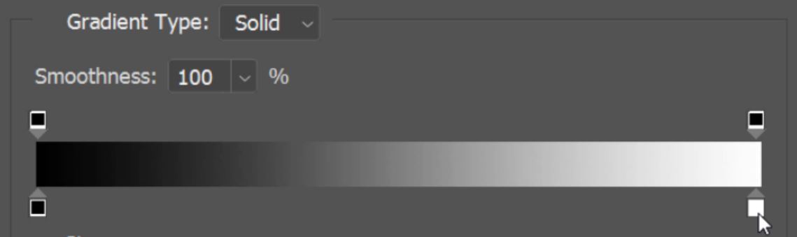
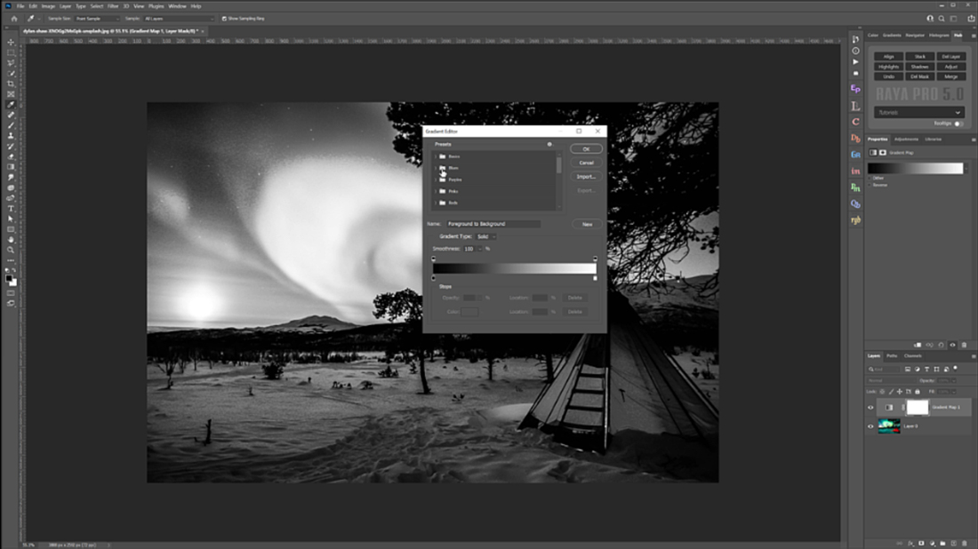
3. My foreground colour is black and my background colour is white. The Default Gradient map that is applied is Foreground to Background.

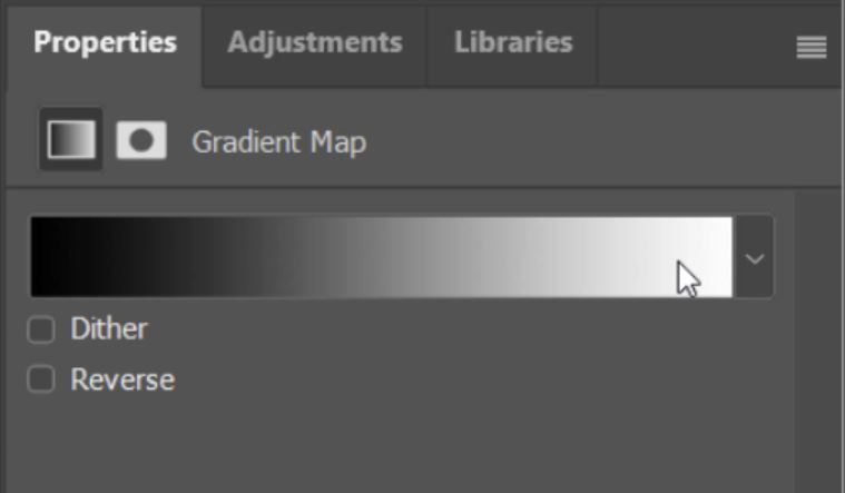
4. To adjust the Gradient Map, double-click on the map in the properties menu.
5. The small box in the bottom left of the below image indicates the colour that is placed in the shadows, in this case, black.
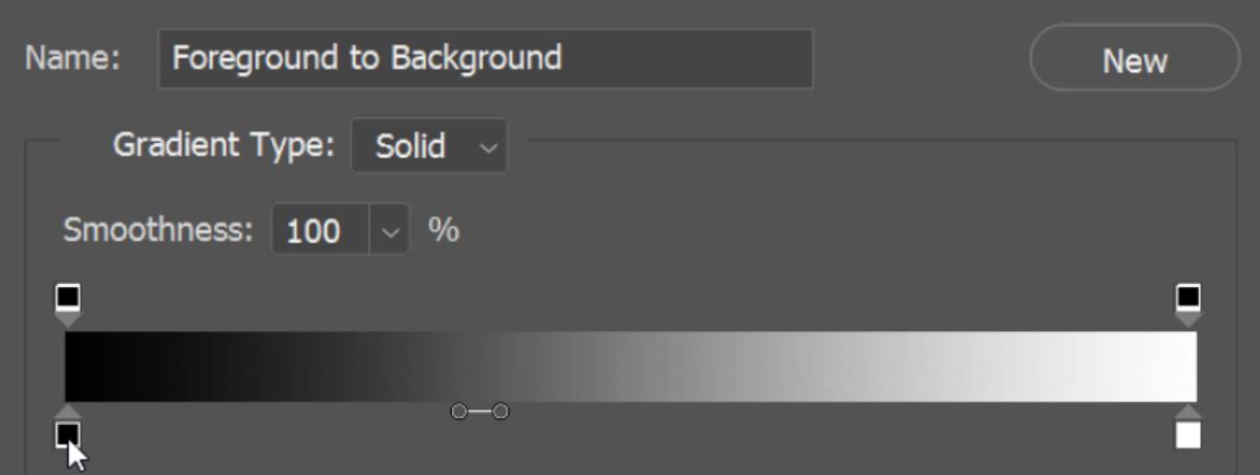
6. The small box in the bottom right of the below image indicates the colour that is placed in the highlights, in this case, white.
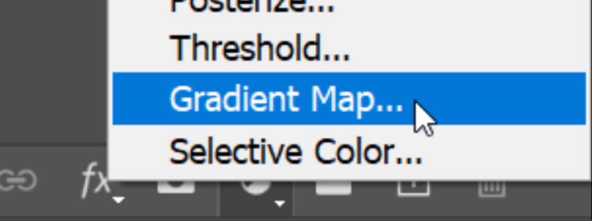
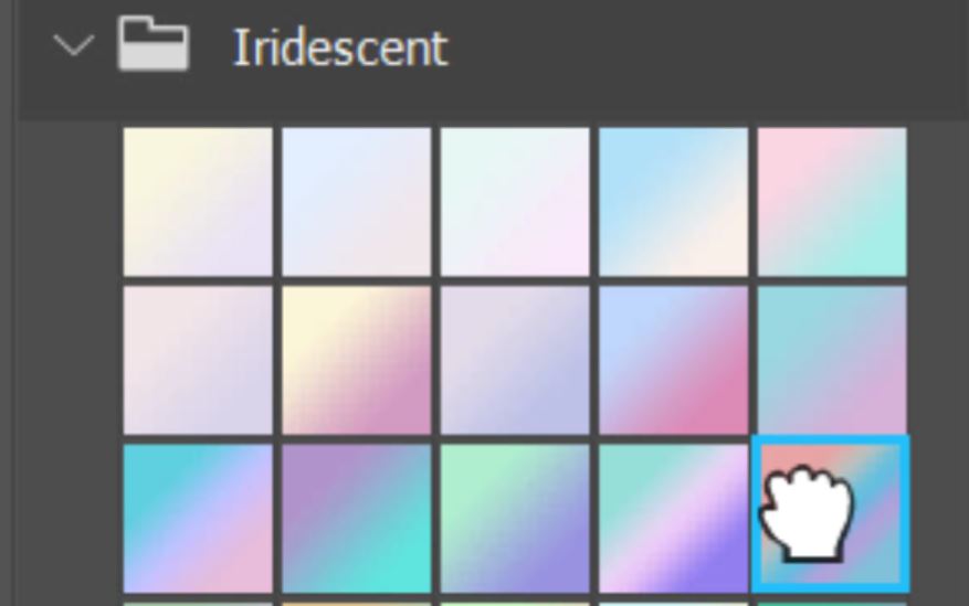
7. In the Preset box, there’s a load of folders, each containing preset gradient maps.
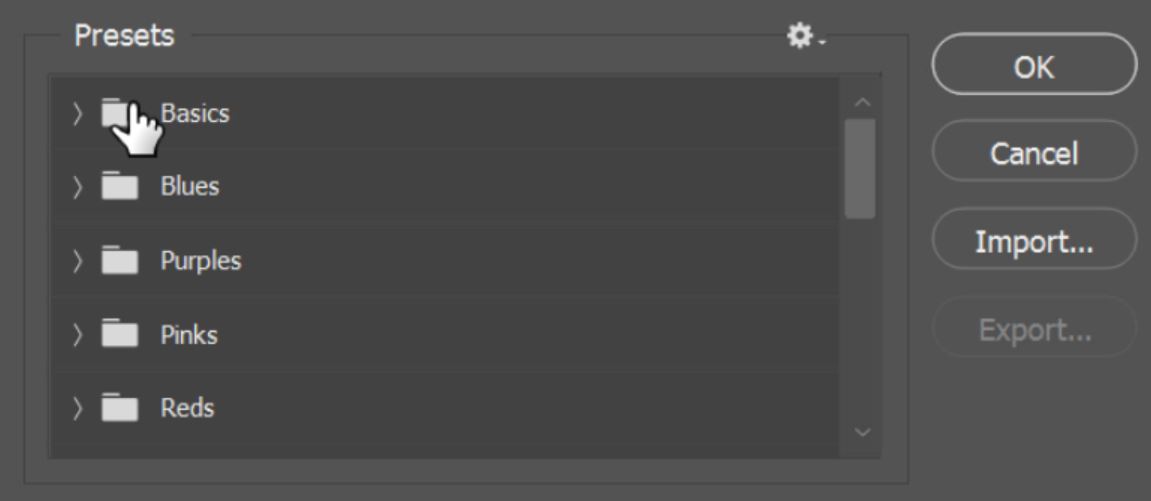
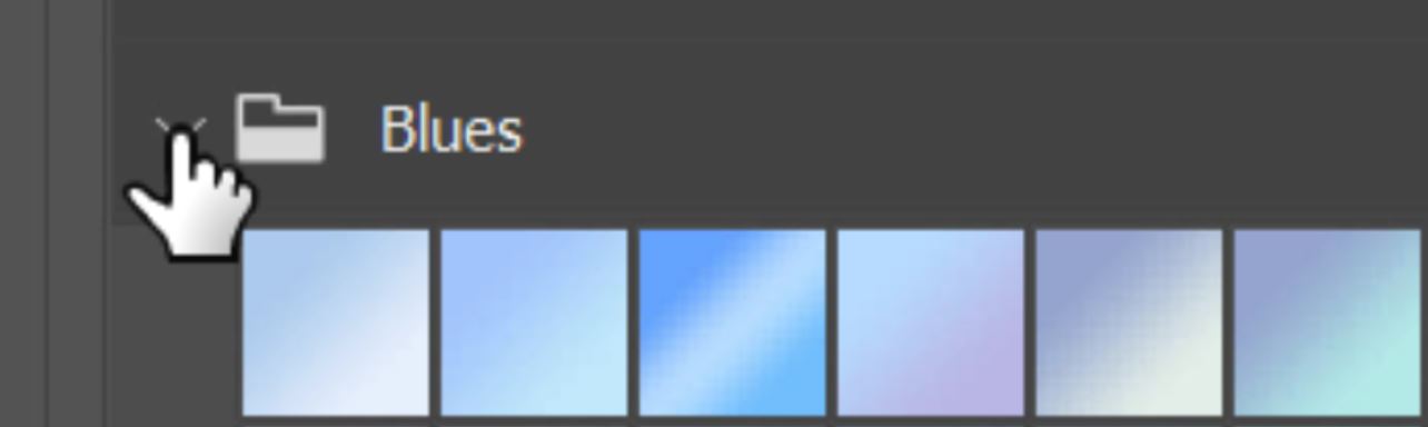
8. Left-click on the down arrow to the left of the folder icons to see the various gradient maps in each folder.
9. To apply a preset gradient map all you need to do is click on the one that you want to apply.
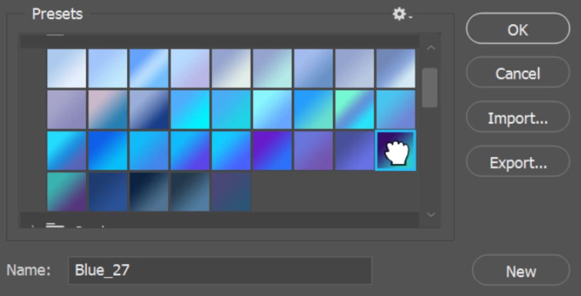
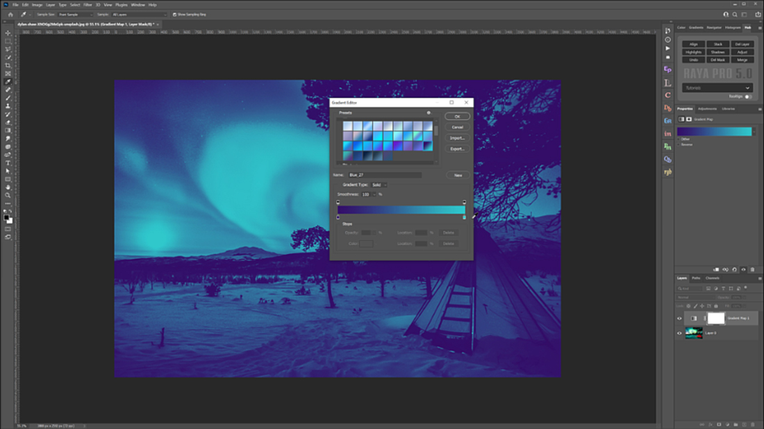
10. Now the colour in the shadows (box in the bottom left corner) is dark blue. And the colour in the highlights (box in the bottom right corner) is turquoise.

11. Below you will see how the image looks with the default foreground to background gradient map compared to the Blue_27 gradient map.
[compare]
 [/compare]
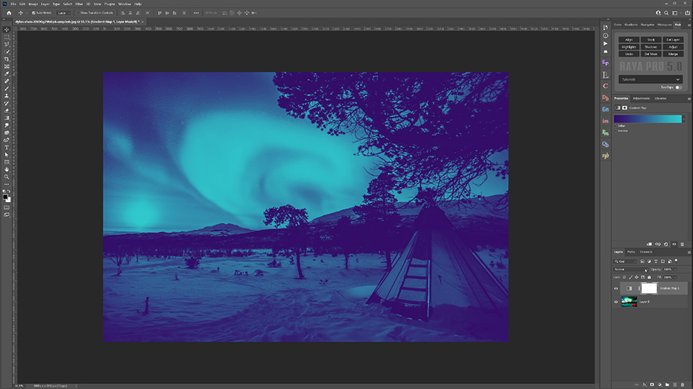
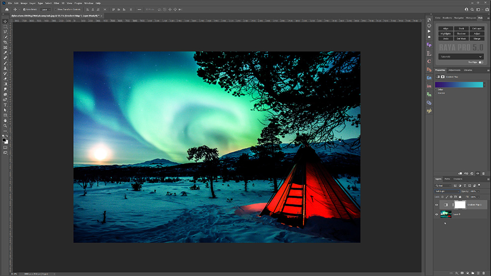
12. To apply the Split Toning effect you need to change the blending mode of the Gradient Map layer.
13. The Blend mode that we use for split toning is Soft Light.
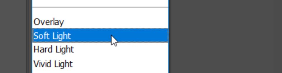
14. As soon as you change the blending mode to Soft Light the split toning effect is applied over your image. Below is the gradient map applied then the image after setting the blend mode to soft light and changing it to split tone.
[compare]
 [/compare]
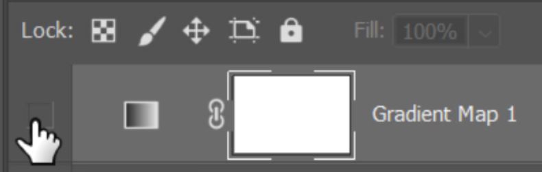
15. You can see the effect really quickly by toggling the visibility of the Gradient Map layer.
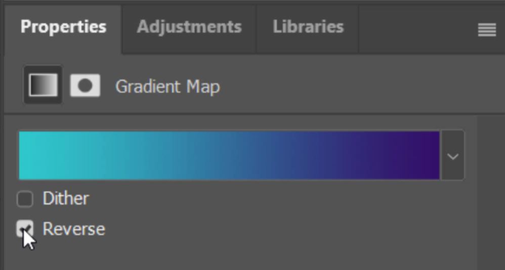
16. You can also reverse the gradient map very quickly by ticking the Reverse Box. This puts the turquoise in the shadows and dark blue in the highlights.
17. You can browse through the gradient maps again by hitting the down arrow in the properties window, and just like in step 7 above you will see the same folders.
18. For this image I like the use of the Iridescent colours, they give a nice, soft, and natural effect.
19. The preset Gradient Map that I used had 5 colours. Pink (Blacks), Grey (Shadows), Blue (Midtones), Purple (Highlights), Soft Blue (Whites).
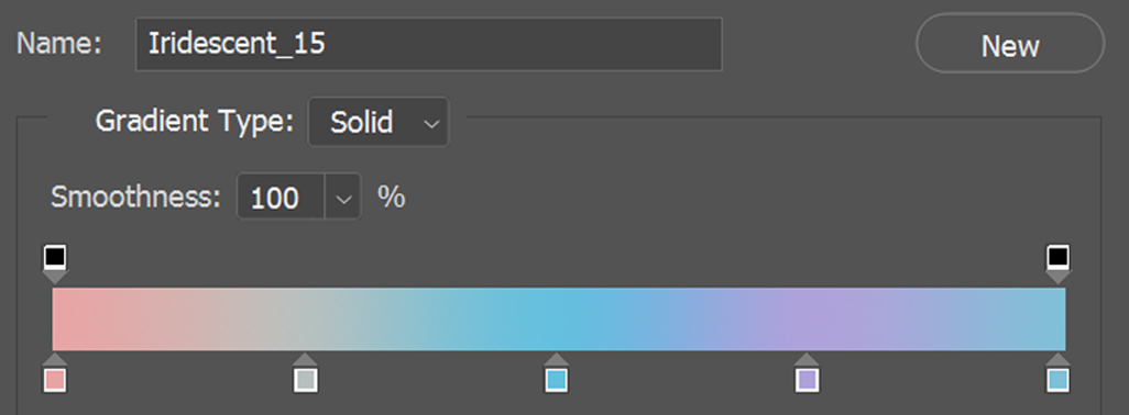
20. Of course, you can change the colours by double-clicking on the little colour boxes.
 [/compare]