Color Grading and LUTs Explained
Article Written By Max Therry
Color grading, once the purview of motion pictures, has been gaining a lot of traction in the photography world. When done well, the effects will deepen the feeling of an image, thereby heightening its storytelling ability. Of course, the bulk of the work of creating a quality image is still done in-camera, but learning how to color grade and/or apply the lookup tables (LUTs) of those who’ve already created fantastic looks, can add another dimension to your work.
Simply put, color grading is the art of tweaking the color and exposure of an image to give it a specific look or feel. For the cinematic feel (it came from movies after all), this will usually involve flattening out the blacks and desaturating some of the colors, as well as split toning with complimentary color schemes. In fact, the split toning is usually one of the more noticeable characteristics, with an orange-highlight/teal-shadow combination being one of the most prevalent. The darker teals bring out the skin tones of the subjects, making them “pop.”
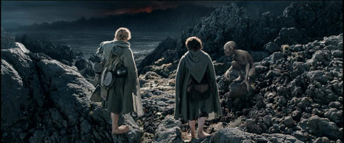
Take this screenshot from The Two Towers. The shadows are a heavy teal, heightening the feeling of bleakness and desolation. At the same time, the orange in the highlights makes the skin tones of the hobbits stand out, as well as accentuating the dramatic lighting. You’ll find this orange/teal color pairing in many, many movies. Basically, the more teal in the shadows, the more emotionally dark the scene. The more orange in the highlights, the lighter the scene.
Of course, orange/teal isn’t the only color pairing. Just about any set of complementary colors on the color wheel can be used (depending on the skin tones of the people in your shot). Below you’ll see a shot from The Fellowship of the Ring, where the accent is on the green in the highlights, with only a touch of magenta being used for the shadows. The intent is to give an aura of peace and tranquility, an effect opposite the heavy teal shadows of the first screenshot.

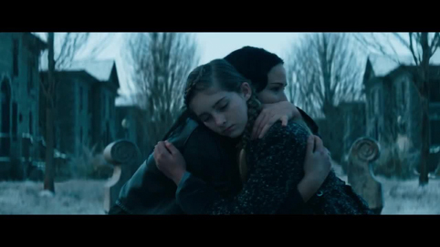
In this next screenshot from Catching Fire, strong teal in the shadows is once again used to create a sense of bleakness. The scene is weighted so heavily towards the teal in the shadows, it even shows up in the skin tones, creating an even stronger sense of hopelessness.
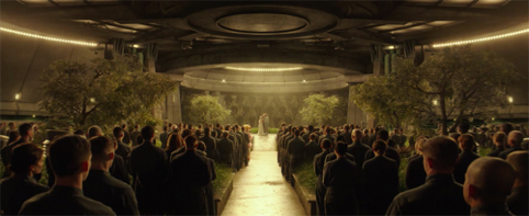
In contrast, this underground wedding scene from Mockingjay Part II accentuates the orange in the highlights to create a sense of celebration, while using magenta in the shadows to offset it with a bit of somberness.
Of course, most of use won’t need all of our photos to have such a strong drama to them, but often just a touch of color grading can make a huge difference in the look and feel of an image.
Using LUTs to Get Color Grading Effects
If you’re an experienced photo editor and have a strong knowledge of the curves adjustment panel, it will be pretty easy to color grade on your own. But if you’re more of a beginner and/or you’re happy exploring the many looks that have already been created, LUTs will be the way to go.
LUTs, or Lookup Tables, are digital files that will apply all the color grading effects for you. The table simply assigns another value to each color involved, turning a set of colors into a different palette. Most color grading looks are recorded in tables, which one can then “look up” again when needed. To a lay person, they’ll seem a lot like presets but that’s a good thing, as it means they’re quite easy to use. In Photoshop, they’re much easier to work with than using actions. (Lightroom doesn’t use LUTs directly—you’ll have to add them to a profile.)
How to Load LUTs into Photoshop
If you have CS6 or newer, you can use 3D LUTs in Photoshop. Here’s how.
- Choose a photo and an LUT you’d like to use with it. (An internet search for free LUTs will bring up plenty of options if you don’t know where to start.)
- Open the photo in Photoshop.
- Navigate to the Adjustment Panel. (If you don’t already have it open, you can find it in the Windows menu.)
- Next, choose the ‘Color Lookup’ icon.
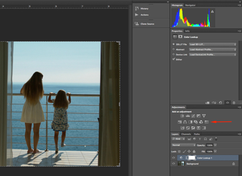
- Click “Load 3D LUT” and you’re good to go.
Conversely, if you want to load more than one at a time, you can simply add the .cube LUT files directly into Photoshop’s ‘3D LUTs’ folder. That will put them in the Color Lookup drop down menu. You can find the folder via Applications > Adobe Photoshop (CC 2017) > Presets > 3DLUTs. Once you put them in the folder, simply restart Photoshop and you’re good to go.
The best thing about LUTs is that there’s a huge variety of both free and premium to choose from, and many offer color grading that can really add that special “something” to your photos.
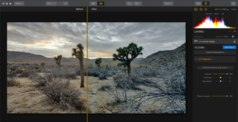
There are as many different forms of color grading as there are looks in the cinema, and which one will look best when applied to still photography really depends on what look you’re going for. The one above adds a “Warm and Cold” feeling to the landscape, adding much more teal to the shadows. The one below, called “Wooden,” is less about the split tones and more about desaturation and crushing the blacks a little.

Keep in mind, though, color grading in general (and LUTs in specific) is meant to be used after all the other adjustments to the image have been made. It’s not intended as a form of color correction. White balance, temperature, and other fixes should always be made before applying an LUT. It’s especially important to make sure your image doesn’t have a color cast to it, as this will definitely throw off the effects of the LUT.

So, if you’re a photographer who likes to tell a story and, in particular, evoke a strong emotion, color grading and LUTs will be a strong addition to your tool set. If you’re comfortable with editing, you’ll probably find the creative process of color grading fun. But even if you’re not, the world of LUTs available is quite vast and will open the door to many new and interesting color effects.
Author
Max Therry is an architecture student who is fond of photography and wants to become a professional photographer. He is also working on a photography blog about photo editing, modern photo trends, and inspiration. Feel free to reach him by email
Enter your email below and join our community of more than 100,000 photographers who have also
Subscribed to our newsletter.
Downloaded our FREE Photoshop Course.
Got our FREE Easy Panel for Photoshop.
And, have our FREE Essential Guide To Luminosity Masks E-Book.
To go directly to any of our products, simply click on the image below.