Understanding Balance in Photography Composition
This Understanding Balance in Photography Composition Article is by Dr. Anastasius Moumtzoglou. If you would like to write for us, please read here.
Α confused or disordered composition is not very interesting to most viewers. In the chaos, there are no significant areas to hold the viewer’s interest and no place for the eye to rest. As a result, the photographer loses the opportunity to create a collaborative bond with a viewer.
On the other hand, a too orderly composition is equally ineffective. An elegant design appears artificial, as too much regularity seems fussy.
Consequently, a composition should include order and disorder. If a photographer achieves this balance, the viewer can get enchanted by chaotic areas, relaxed in the ordered portions, and trust the authenticity of the photograph.
Compositional Balance
When photographers create compositional balance, they create a space that is easy for viewers to look at. Overall, balance is perceived when a photograph includes areas which are balanced in every part of the composition. It is reached by shifting the frame and juxtaposing subjects within it, so objects, tones, and colours are of equal visual weight.
A balanced image looks healthy, robust, and complete when its elements are in balance; there is an overarching sensation of equilibrium, harmony, and unity. Many theories in psychology talk about how the balance of emotions and personality traits contribute to mental health.
The visual balance can take a variety of forms, both visually and psychologically. Still, we have to take into account that when the balance is lacking, tension results come into play.
Subsequently, the question revolves around the equilibrium of tension and balance. For instance, when we use asymmetrical balance and the golden ratio, images tend to be more interesting, as the mind spends more time investigating them.
Achieving balance in photography is not an easy task
First, we have to familiarise with the following ideas:
- Visual Weight
- The Fulcrum
- The golden ratio
- Vertical/Horizontal
- Rest/Energy
- Foreground/Background
- Emotional balance
- Balance by interest, size, and tone
- Balance of similarity and difference
- Balance of contrasts
- Symmetrical balance
- Asymmetrical or dynamic balance
- Radial and crystallographic symmetry
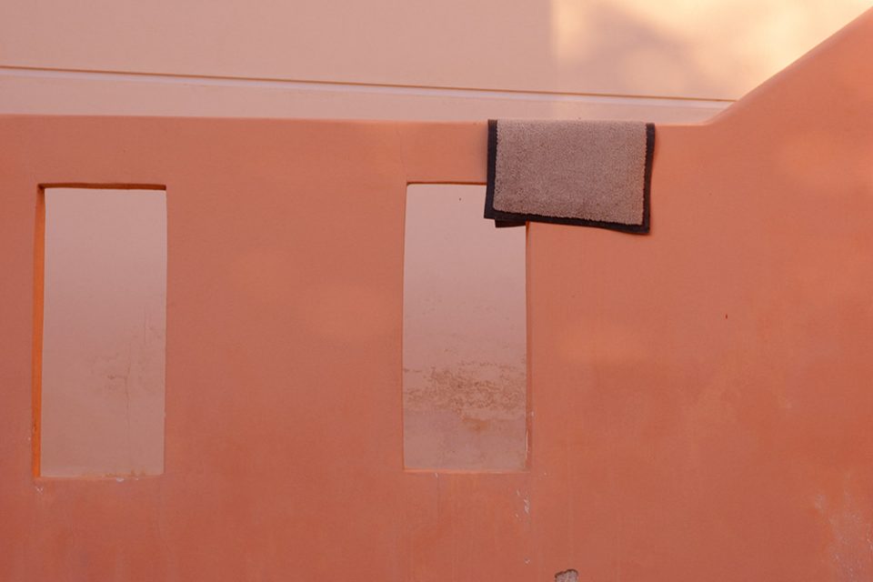
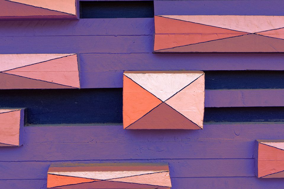
Let’s start with the ideas of the visual weight and that of the fulcrum. First, we have to understand those image elements which are more prominent, brighter, and more colourful have greater importance than objects that are smaller, darker, and less colourful. Moreover, the greater the visual value, the more the eye is drawn to that element of the image. Last but not least, the relative visual weights of the image elements contribute to the sense of equilibrium, as when the proportions of weight feel right, the photo feels balanced (see photo below).

The second idea we have to refer to is that of the fulcrum. According to the fulcrum principle, the elements of a photo can be seated on a seesaw. If the subject of the photograph is far from the pivot point, it can counteract a more massive item which is closer to that point (see photo below).

Then, we should turn to the well-known idea of asymmetrical or dynamic balance which relates to the concept of the rule of thirds. The rule of thirds concept was mentioned by John Thomas Smith in 1797, in his book ‘Remarks on Rural Scenery’. Smith quotes the 1783 work of Sir Joshua Reynolds, in which he discusses the balance of dark and light values in a painting. Then, he continues stating that ‘two distinct, equal lights should never appear in the same picture. One should be principal, and the rest subordinate, both in dimension and degree’ naming the idea as the ‘rule of thirds.’
Unequal parts and gradations lead the attention quickly to different positions while aspects of similar appearance hold it awkwardly suspended. Accordingly, we achieve the utmost force and solidity by introducing light and dark elements in a photograph (see photo below).

However, if a photographer is not careful, it is easy to create an imbalance in such a composition.
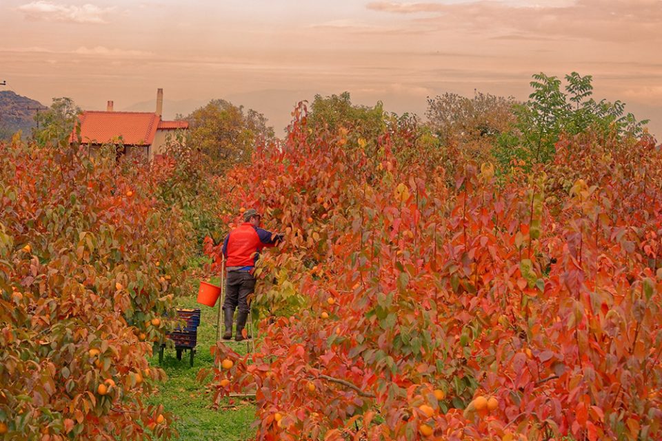
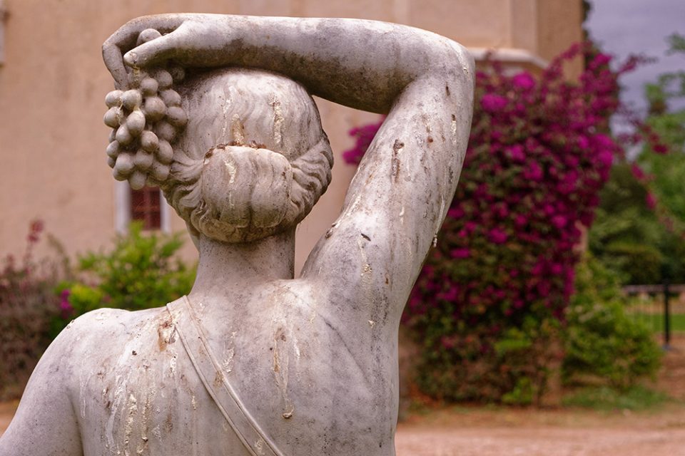
Conceptual balance is the more philosophical viewpoint of asymmetrical balance. It relates to the idea that two subjects might complement each other and are different beyond size, shape and form. In many aspects, conceptual balance is achieved when there are two contrasting textures or meanings behind its subjects (see photo below).
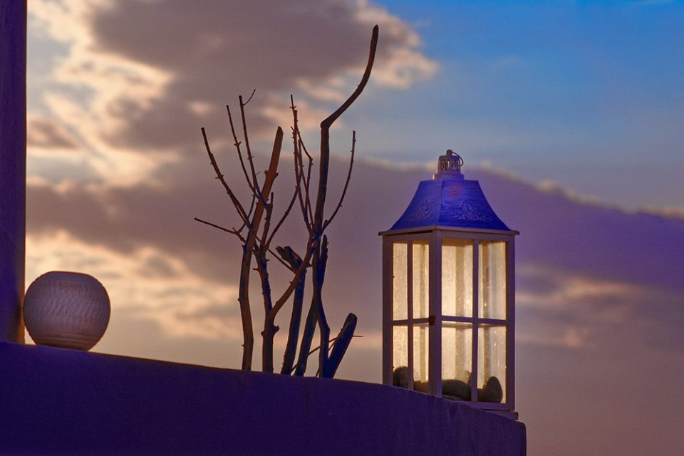
Another exciting way to create asymmetrical balance is by using colours. If there are too many vibrant colours, such as reds and oranges, the image looks overwhelming. Consequently, colour balance can be achieved by balancing out a small area of vibrant colour with a larger size of neutral or more pastel colours or vice versa (see photo below).
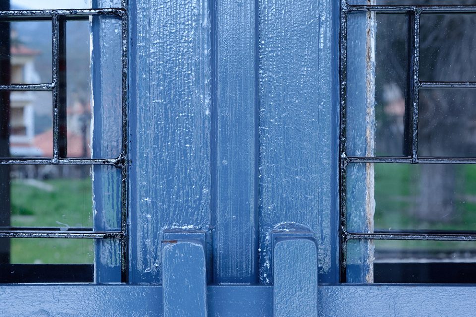
Finally, tonal balance, which is another aspect of asymmetrical balance, is best observed in monochromatic images where we can distinguish different tones. In that case, tonal balance is seen in terms of contrast (see photo below).

The second common rule is the well-known idea of the ‘golden ratio’ or Fibonacci spiral. The golden ratio is a component of every natural object and can be written as a mathematical equation or as 1:1.618.
When it comes to golden ratio vs the rule of thirds, the decision depends on what you photograph, as the rule of thirds adds interest to a minimal scene and the golden ratio emphasises movement. When the focal point of a picture clearly emphasises one specific subject, it is worth placing it at an intersecting end of a nine grid.
On the other hand, by using the golden ratio concept, the viewer’s eyes move along the line, ending resting on the end of the spiral (see photo below).
Symmetrical balance also called informal balance, is the most common way to photograph an image as it is natural for people to place their main subject’s right in the middle of the frame. In symmetrically balanced photos, both sides of the frame have equal weight and are intentionally centred on looking perfectly symmetrical when split horizontally or vertically in half. In symmetrical balance, both sides and the top and bottom of an image, mirror each other in a very predictable, formal, and orderly way. Although pleasing, the photograph sometimes might seem too predictable and perhaps even dull (see photo below).
Following symmetrical balance, we should refer to radial and crystallographic symmetry in which elements and patterns radiate out from a central point, creating a sensation of spiralling and inward/outward movement (see photo below).
Balance of interest, size, and tone means that small, exciting areas of an image can balance large, dull ones or to put in a different way, large or bright elements can balance small, muted, or dark ones (see photo below).

The Balance of Contrast
Balance of contrasts is attributed to the Bauhaus school of photography (the early 1900s), and especially Johannes Itten, one of the masters of that movement. They created a list of possible contrasts, including items such as:
- Point/line.
- High/low.
- Long/short.
- Broad/narrow.
- Thick/thin.
- Light/dark.
- Black/white.
- Much/little.
- Straight/curved.
- Pointed/blunt.
- Horizontal/vertical
- Diagonal/circular.
- Smooth/rough
- Still/moving.
- Light/heavy.
- Transparent/opaque.
- Continuous/intermittent.
- Liquid/solid.
- Sweet/sour.
- Strong/weak.
- Loud/soft.
The previous ideas include the senses of vision, taste, sound, and touch, which should not only be translated into a graphic regarding a photograph but also being balanced within a picture (see photo below).

Balance can also be realised by the foreground and background and vertical and horizontal aspects of an image. The mind considers a flat part as a state of rest and the vertical element as moving upwards or downwards. Those result in a balance of rest and energy (see photo below).
Balance of similarity and difference refers to the idea that an element of an image which differs drastically from the other aspects, stands out as a focal point. Overall, balance and unity might be lost if all the elements are very similar. In contrast, compensation of similarity and difference of unity and variety often results in an exciting image (see photo below).

Finally, we should remember that the above compositional rules are only recommendations. Photographers should train their creative eye, and compose photos in their way, which might not even fit any of the above ‘limitations’.
About Dr. Anastasius Moumtzoglou
He studied photography at the New York Institute of Photography and writes articles on photography at his column ‘Postscript’ of the ‘Photographos’ magazine. He is the President of the Mountainous Corinth Photography Festival and the co-organiser of the ‘Edibles’ food photography competition. He has participated in many exhibitions while his photographs have been published in Greece and abroad. He is also the recipient of many awards.
FREE Photoshop Course

The Art Of Photography
Raya Pro

Thank you for reading this article, be sure to sign up for our newsletter for more tutorials and great offers.
Enter your email below and join our community of more than 100,000 photographers who have
- Subscribed to our newsletter.
- Downloaded our FREE Photoshop Course.
- Use our FREE Easy panel in Photoshop.